When you’re the founder of an ambitious startup, ready to pitch your vision to a group of seasoned investors, you can feel underwhelmed by ever-present pressure. The stakes couldn’t be higher for the future of your newly built venture. Yet, even the most promising ideas can fall flat if they’re buried beneath a confusing, uninspired pitch deck presented to investors and stakeholders.
Far too many bright entrepreneurs make avoidable missteps in the early years of their startup that leave their dreams on the floor. The common thread? It all starts with the deck.
Below, you’ll find the most prevalent missteps our team witnessed, paired with actionable insight and the ways to overcome them. Consider this your 10-point checklist to guide you toward a winning presentation that commands attention and earns the next meeting.
WHAT'S IN THE ARTICLE
Why a Pitch Deck Matters in Startup Fundraising
A pitch deck is so much more than slides on a screen. It’s often the first interaction investors have with a business. So they need to grasp the core of it based on several pictures with text. Clarity and the ability to tell a compelling story become a must for any pitch deck. Mostly because venture capital firms and angel investors browse hundreds of pitches every month.
It’s easy to forget that investors are not just assessing market potential; they’re also evaluating the founders’ vision, communication skills, and ability to execute under pressure. Each slide should reflect the thoughtfulness and potential of the business and team in the same score.
Often, investors make decisions in minutes, not hours. The pitch deck, therefore, becomes the ultimate distillation of months, or even years, of work. It’s a shot at convincing an investor to give a fledgling business a chance, which can be the difference between securing a pivotal meeting or facing a cold silence.
Key Objectives of an Outstanding Pitch Deck
A well-crafted pitch deck achieves several things:
- Presents your business idea and value proposition effectively
- Communicates your understanding of the market and competitive landscape
- Demonstrates the problem you solve and your unique approach to solving it
- Introduces your team and why they are the right people for the job
- Details how you plan to make money and your traction to date
- Shows how much capital you need and how you will use it

Looking to Build an MVP without worries about strategy planning?
EVNE Developers is a dedicated software development team with a product mindset.
We’ll be happy to help you turn your idea into life and successfully monetize it.
10 Biggest Pitch Deck Mistakes Startup Founders Must Steer Clear Of
Before diving in, it helps to understand how to evaluate a pitch deck from an investor’s perspective. Knowing the criteria investors use will make it easier to avoid these pitch deck mistakes in the first place.
1. Too Many Slides
A pitch deck overloaded with slides signals uncertainty and a lack of focus. Investors seek clarity; straight communication is a mark of respect for their time. While there’s no one-size-fits-all, decks running past 15 slides often dive too deep into tiny details that dilute your message.
- Audience attention plummets after a dozen slides.
- More content increases cognitive load, so the investors find it harder to grasp your value proposition.
- Cutting slides forces better prioritisation, highlighting your ability to make strategic decisions.
Keep your deck lean.
Outlines that succeed often fall in these ranges:
- Seed/Pre-seed: 8–12 slides
- Series A or later: 12–15 slides
- Competition Finals: 7–10 slides
Does that mean you shortcut key points? Absolutely not. Every slide must earn its place and submit to its task. Practice distilling complex themes to their core, and your audience will thank you.
2. Too Much Text or Information
A wall of words is the fastest way to lose an investor’s attention. Bullet points morphing into mini-essays, dense data dumps, and tiny fonts are hallmarks of bad decks that only mess with your brain.
You do need to build a deep report on your business condition when you’re telling the story.
- Each slide should support your narrative with definitive visuals and not replace it with completely different info.
- Use strong and short headlines and powerful visuals.
- Give numbers when they matter, but never at the cost of readability.
Strong decks function as a guiding point for your audience’s focus as you present. Practice your delivery so every point is crisp and purposeful.
3. Poor Layout & Design
Design is about more than aesthetics. It’s a reflection of your brand’s sophistication, attention to detail, and care for important moments. Investors will judge, they can’t help it.
Obvious design flaws include:
- Inconsistent color palettes
- Misaligned text and visuals
- Amateurish clip art or overused stock imagery
- Errors in formatting and font choices
Design communicates confidence and competence.
A few layout principles to adopt:
- Prioritize readability over flair.
- Treat whitespace as a friend, framing your key points.
- Use clean, modern visuals.
- Keep iconography relevant and supportive.
If you do not feel familiar with the design, invest in a professional. Your slides should feel intentional, clear and branding-based from beginning to end. For some founders, collaborating with a software product development company can also bring in the right mix of design and technical expertise to strengthen the deck.
4. Lack of Storytelling & Narrative Flow
Data is necessary. But without an overarching story, even strong metrics fail to intrigue.
Great decks read like narratives: challenge, insight, solution, validation, and growth vision. Each slide sets up the next, causing both rational and emotional feedback from your audience.
Many founders make the mistake of simply piling information in a disconnected manner, a fatal error.
Here’s why narrative flow matters:
- Stories build trust and empathy
- A logical sequence makes retention easier
- Emotional resonance increases engagement
Strive for a structure that moves your audience. Introduce the pressing need, articulate the opportunity, explain your unique solution, and demonstrate traction. By the final slide, investors should see the arc of your vision and their role in it.
5. No Market Validation or Traction
One of the common pitch deck mistakes is showcasing a problem without backing it up with evidence of validation. Bold claims mean little without proof. Too often, startups present a “problem slide in pitch deck” or diagram that waxes poetic on “massive markets” but fails to show evidence of validation.
What investors want:
- Early customer feedback and engagement metrics
- Letters of intent, pilot contracts, pipeline data
- Partnerships or press coverage
Concrete evidence of product-market fit speaks volumes. When early signals of adoption are missing, it raises red flags about desirability or feasibility.
Whether you’re pre-revenue or scaling, include real market interactions. Highlight pilot programs, waiting lists, sold-out launches, or any quantifiable support. Even modest wins, if well-presented, can tip the balance toward belief.
6. Unclear Business Model & Financial Projections
Glowing promises about future revenue, without a coherent business model, erode credibility. Honest financial projection, paired with a lucid explanation of your revenue streams and cost structure, shows maturity.
Companies falter by:
- Skipping cost assumptions and customer acquisition logic
- Relying on hockey-stick revenue curves without context
- Avoiding sensitive questions about burn rate or margins
Even if numbers are early-stage estimates, walk the talk. Break down how you make (and keep) money. Show both near-term and longer-term potential, grounded in market reality. Transparently address risks, assumptions, and your plan for operational discipline.
A practical table you might consider including:
| Financial Projection | Year 1 | Year 2 | Year 3 |
| Revenue ($M) | 0.3 | 1.5 | 4.2 |
| Expenses ($M) | 0.8 | 1.2 | 2.1 |
| Net Profit/Loss ($M) | -0.5 | 0.3 | 2.1 |
Simple, clear, and honest, so the numbers speak for themselves.
7. Ignoring or Poorly Presenting Competition
Either ignoring the competitive landscape or producing clichéd 2×2 grids where you’re the only player in the “top right quadrant” is a rookie move. Every creative space draws competitors, even if they take a different approach.
Thoughtful analysis communicates respect for the complexity of the market and your adaptability.
What does a compelling competition slide demonstrate?
- Direct and indirect competitors acknowledged by name
- Differentiators explained, not just claimed
- Realistic SWOT or comparative features, with both strengths and challenges noted
A pitch deck specialist will tell you: Investors are naturally skeptical. Competitor analysis is about more than posturing. It’s about conveying informed strategy and a willingness to adapt.
8. Weak Team Slide
A winning team slide is never a generic amalgamation of headshots.
Showcase why your team is built to win. Go beyond degrees and job titles, highlight relevant experience, previous exits, entrepreneurial grit, and unique perspective.
Avoid the mistake of overstating or omitting. Instead:
- Feature one-line bios that tie each member’s background to the business.
- Spotlight advisors or key hires, especially in domains where investors may have doubts about your expertise.
- Use logos of recognizable previous employers or successful startups.
Your audience must come away believing, “This is the group that can defy the odds.”
9. Lack of a Clear Funding Ask
Be bold and precise when discussing what you’re seeking. Some founders shy away from stating their ask, or worse, forget it altogether.
A strong funding slide answers:
- How much do you want?
- What will you do with the money? (e.g., team growth, product R&D, go-to-market ramp)
- What milestones will this capital unlock?
Ambiguity raises questions about your planning ability and transparency. Investors want to see clarity and conviction. If you’re seeking $1.2M for 18 months of runway to grow your engineering team, say so. If you’ll allocate 40% to sales and 60% to development, show the breakdown.
10. Jargon Overload
Technical jargon and buzzwords create miscommunication and numerous barriers, specifically when you want to be heard under stressful conditions. Remember that not everyone has deep knowledge in the specifics of your domain, especially during early rounds or with completely fresh concepts. Any successful communication starts with empathy for your audience.
Don’t assume your audience’s expertise matches your own. Instead:
- Speak plainly with simple words and short sentences.
- Define critical terms when they’re introduced and make necessary descriptions.
- Use analogies and metaphors for complex concepts.
Jargon-laden decks often signal insecurity or a lack of customer orientation. Investors repeatedly ask, “Which of the following is true of pitch decks? Simplicity wins more often than cleverness.” The clearest presentations are often the most memorable.

Proving the Concept for FinTech Startup with a Smart Algorithm for Detecting Subscriptions
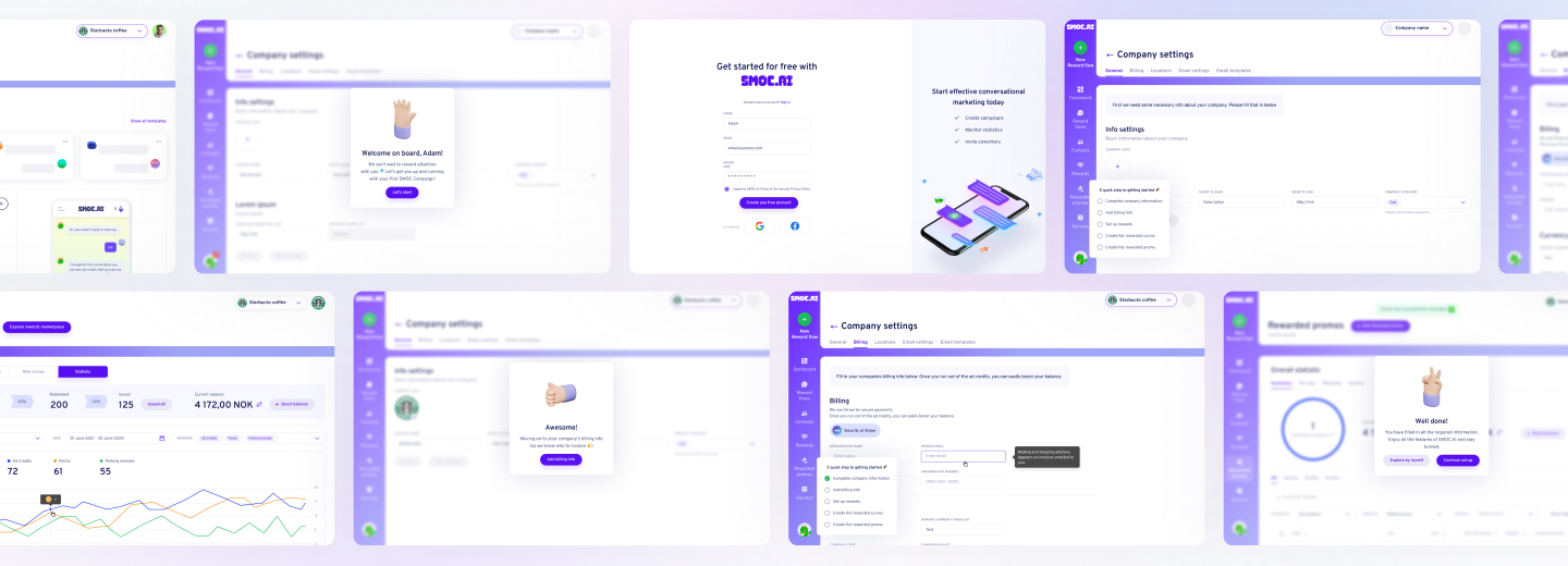
Scaling from Prototype into a User-Friendly and Conversational Marketing Platform
The Anatomy of an Effective Pitch Deck
The market or startup stage can influence pitch deck structure, but still, they often have distinctive core elements that make them successful. Here’s a look at the standard progression, along with some tips for each section:
| Slide | Purpose | Pro Tips |
| Title | Make a memorable first impression | Clear company name, tagline, and contact info |
| Problem | Show real pain points worth solving | Use relatable stories or striking statistics |
| Solution | Present your innovative answer | Simple visuals trump complex text |
| Market | Reveal the scale of the opportunity | Total, serviceable, and obtainable markets |
| Product | Let your product/service stand out | Screenshots or demos add credibility |
| Business Model | Explain how you’ll make money | Be clear and succinct |
| Traction | Prove you’re gaining momentum | Charts with key metrics work best |
| Competition | Show you’re aware of the landscape | Honest, rational comparisons earn respect |
| Team | Highlight experience and passion | Photos and short bios personalize your story |
| Financials | Offer a realistic forecast | Year-by-year projections, not spreadsheets |
| Ask | State what you need and why | Be specific; outline use of funds |
Tailoring Your Deck for the Right Audience
No two investor meetings are the same. Some audiences may be deeply technical, whereas others care more about the market or financial upside. Make small, thoughtful customizations to each version of your deck. Highlight parts that address your listeners’ backgrounds and interests. This flexibility signals professionalism and thorough preparation.
There’s also the format to consider. When emailing your deck, keep it clear enough to stand alone. For live presentations, design it to complement your spoken narrative, allowing you to maintain eye contact and answer questions confidently.
Winning Storytelling Techniques
Many of the strongest decks rely on the power of story attached to dry facts. They show a protagonist with a problem, the thrill of a new solution, the promise of impact. Done well, this forges an emotional connection that numbers alone can’t achieve.
Storytelling in decks doesn’t mean embellishment. It’s about structure and engagement. Try these techniques:
- Begin with a relatable anecdote or statistic
- Use visuals to simplify complex ideas
- Highlight moments of real customer wins, not just projections
- Guide the audience through your “aha” moment, when everything clicked for your business
The Visual Element: Clarity Counts
Pitch decks aren’t research papers. Great design doesn’t have to be expensive or elaborate. Simple color schemes, spacious layouts, and consistent fonts keep the focus on your message, not on distracting effects and help with following your line. Charts, product screenshots, and customer testimonials provide substance.
Limit text to essential points. Each slide should answer a single question. Instead of adding blocks of dense text, look for ways to omit it, break it up or represent it graphically.
Perfecting the Flow and Timing
Flow matters. Each slide should naturally lead to the next without losing the attention, rather making it interesting about what will come next. In a live setting, decks are usually designed for a 10 to 20-minute delivery. In such a way, each slide guides the conversation, shows key facts, and frames questions for the audience to ask at the end.
The Lifespan of a Good Pitch Deck
The strongest founders treat the pitch deck as a living document, not a static artefact and update their decks regularly. New investment, milestone, changes to product strategy, or results from outreach efforts should influence the pitch deck you present.
Signs It’s Time to Refresh Your Deck:
- Feedback indicates points of confusion or skepticism
- A key competitor releases something similar
- Your business model or audience focus shifts
- You add team members or advisors with significant credentials
- Traction metrics change (for better or worse)
What Investors Really Look For
Investors are in the business of calculated risk. They look for passion, resilience, grit, as well as a business that solves a meaningful problem and can scale. Your product may be unique and your team outstanding, but if your pitch deck doesn’t communicate these clearly, it may not matter.
A strong deck leaves investors thinking:
- “Are they tackling a real pain point?”
- “Can this team deliver?”
- “Is the timing right?”
- “Can I trust their numbers?”
- “Would I feel excited to call this founder for an update in a year?”

Need Checking What Your Product Market is Able to Offer?
EVNE Developers is a dedicated software development team with a product mindset.
We’ll be happy to help you turn your idea into life and successfully monetize it.
Conclusion
Consider these best practices that separate good decks from unforgettable ones:
- Rehearse until your delivery is smooth but not robotic
- Solicit honest feedback from friendly investors or mentors
- Assume investors will share your deck, so ensure every slide is clear on its own
- Avoid overpromising, understate and then overdeliver when you move to the due diligence stage
- Keep your design consistent and uncluttered
- Prepare a one-sentence summary of your business (“the elevator pitch”)
A carefully crafted pitch deck is opportunity’s best advocate. Avoiding the most common pitch deck mistakes demands intention, skill, and constant iteration. If you found yourself nodding along or questioning your current deck, reach out. Sometimes that extra dose of expertise is all you need to shine.
Let’s connect and your next funding stage could be one compelling presentation away.
While there’s some flexibility, the strongest decks usually land between 10 and 15 slides. Early-stage founders can occasionally go as low as 8, focusing on essentials like the problem slide in pitch deck, solution, traction, team, and ask.
Absolutely. A well-designed deck signals professionalism and makes information easier to digest.
These professionals bring design flair and deep insights on how to structure a narrative that hooks investors and keeps them engaged. For founders who struggle to maintain objectivity or polish, an pitch deck expert is often an accelerator.
Some of the most common pitch deck mistakes around structure include burying the lead (your value prop isn’t clear up front), duplicating content, missing slides (like the team or ask), or creating a disjointed flow without narrative cohesion.
Every effective deck should leave no doubt about:
- What problem are you solving?
- How big and urgent is the pain point?
- Why is your approach distinctly better?
- Who are your customers, and how do you reach them?
- What traction have you achieved so far?
- What does the competitive landscape look like?
- Who makes up your team, and why are you qualified?
- What are your financials and projections?
- How much funding are you seeking, and how will it be used?
If an investor leaves your presentation uncertain about any of the above, revisit your slides with fresh eyes.
Startups frequently inflate projections, ignore cost structure, or overestimate market share without substantiation. Another frequent error: neglecting to explain assumptions, leaving investors puzzled about the basis for your math.

About author
Roman Bondarenko is the CEO of EVNE Developers. He is an expert in software development and technological entrepreneurship and has 10+years of experience in digital transformation consulting in Healthcare, FinTech, Supply Chain and Logistics.
Author | CEO EVNE Developers


")