With this article, we define the most common divisions between the UIUX and SEO approaches in digital design creation. A comprehensive analysis will help to specify whether they are rivals or associates. The article can help junior specialists dive into the field of these two ideas, the more experienced ones can emphasise the elements they need for specific purposes.
Two different approaches to how the users perceive the information define the visual appearance of the website. Traditionally it is considered that they are rivals on the battlefield of the interface.
Search engine optimization is necessary to prepare the content of the website to be vivid for crawlers. UI and UX are made for users specifically to solve their tasks with the help of a digital tool. The first one emphasises the text and its meaningful elements, and the UI pays more attention to the visual and pictorial representation of primal meanings.
Many designers in practice tend to create nicely-looking pictures avoiding SEO and simply thinking that texts written for people will work both sides. Though that rarely works the best way in reality. You get a non-optimized website that challenges the user trying to scan it. The truth is in the fact that a nice looking website means nothing when the users can find it. With this idea in mind, UIUX and SEO are probably more alliances than rivals.
First, let’s discover more traditional approaches and points of a website structure where they act differently.
SEO vs UIUX Design — fighting round 1
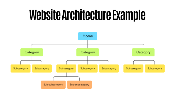
Overall website structure
There are various points in which these two techniques work for design in different ways. Most global deals with the overall website structure. Most SEO specialists admit that the website structure should be strictly cross-linked and clear. The designers trying to create something eye-catching and unusual sometimes ignore the classic structure and build the corporate website with a single page. Such an approach can not be called a mistake, as the websites built for different purposes require different techniques. Nevertheless, it can become a true nightmare for SEO.
Single-page websites
If to talk about the specific type of websites — one-page landings are much harder to promote organically. They have fewer keywords, which is obvious. The behavioural factors of the visitors of such websites mess with the search engines in understanding its value. People can not navigate around numerous pages searching for the particular information they are interested in.
Mess in headings hierarchy
The other problem of websites is the absence of a strict hierarchy with headings. Mostly this issue arises with landings, though the websites that are designed to be trendy can face it as well. In the terms of optimised pages, there should be one title, description, heading of the first level and only there can go several H2 and further titles. For the sake of the impressive design, one page can include several H1 headings, H2 headings that can be placed above H1 and have other messy elements in the structure.
Animated words that should be headings
A complicated set of animations placed on the text that should be an H1 title disables any possibilities of getting the title. When animated for a gradual appearance letter by letter or word by word, the entire phrase can not be a title, as each letter or word can serve as a separate H1. Such animations can ruin the primary intention to charge the title with the keywords unless your developers know the techniques how to do things right. Juniors can find that task too complicated.
Free space information arrangement
Now, let us shift the attention from landings to simple websites designed according to modern tendencies. A lot of free space on the page is needed to focus the users’ attention on the converting points of the website, such as lead forms or buttons. Generally, optimization is not against any free places on the page, though every part of negative space can be filled with a great volume of useful information.
Heavy-weight pictures or videos
In case free space is needed for the visual composition, the application of a single-colour background or photo can be better than the use of high-weight videos or 3D animations. The high-quality pictures in big resolution enlarge the page loading period. The search engines and the visitors do not like the pages when the loading time of the first visible content is longer than 5 seconds. The time to the first interaction will suffer as well.
Organic promotion with pictures
On the other hand, pictures are good for SEO as they enable an additional level of promotion — through alternative text and search by images. Though, people rarely use the proper naming and apply alternative text correctly. Most commonly, we face names built from random numbers and letters. In practice, such a shortage can be easily eliminated. The meaningful names for the pictures can positively influence the UX in the terms of accessibility. People applying tools like screen readers can use your website and feel comfortable there.
Usage of pop-ups
The pop-ups for the design beauty instead of separate sub-pages can become a problem for structuring the site map and tracking the conversions that failed halfway through. Though such semi-pages can add to the design value, their impact on non-ability to convey the value to analytics can be huge.
Needless to say that SEO and design are important for website promotion and serviceability. In fact, it becomes difficult to distinguish which of them provides more value to this goal. Being rivals is not the only thing SEO and UIUX can do for a website. Here are the points with which they can supplement each other.
UIUX Design and SEO — assisting round 1
First-glance visual attractiveness
Non-obvious, but a UX and UI can directly influence SEO parameters, such as bounce rate and average time spent on the page. These two parameters can show the search engine that the content of the website is engaging and useful for visitors. The fewer people close the website without any clicking, the better for SEO. Such behaviour can be reached with the addition of unusual animations, clickable pictures, carousels and other techniques besides the textual content quality.
Content corresponding to the requests of users
The task is not to disappoint the visitors that came to the website for the particular information they got from the keywords. Reaching the balance between provocation for the action and care about users’ needs makes both approaches a convenient instrument for business development. This approach defines the CTAs of the ads or active elements on the webpage leading to other pages.
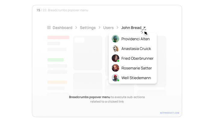
Application of breadcrumbs
The designers can create the bread crumbs shown in the interface somewhere on the page to help SEO. Traditionally designers tend to avoid them like ugly artefacts. Though, when observing them, the users understand their current position on the website. This point is one of the heuristics defining a user-friendly design to which most designers strive. What can be better than showing your ability to make beauty from common things?
Meaningful query strings
This point deals not directly with the UI but mostly with the UX, and makes the navigation much easier and clearer. The application of query strings that include meaningful names is rather better than numbers or combinations of random letters. That will help both users and search engines to navigate around the website and find the necessary information faster.
Internal linking
Building the internal system of interconnected pages within a website makes users interested in the content they percept. With the application of proper techniques, it is possible to capture the users’ attention and drag them to other articesproducts whatever is displayed on the website.
To achieve harmony and fast organic promotion, the designers should care both for SEO and clear UI and UX. These two approaches deal with two sides of the coin for one purpose — making the business reach the goals through the satisfaction of the needs of the customers. So the answer to the entering question is that the war should be no more optimisation and beauty can walk side by side for better designs.
What is left at the end in practice?
I experienced numerous times when the customer wished to get an impressive interface without considerations on how this interface should act. In such a situation, a designer should specify the primary goals of the designed product and use them as the basis for decisions taken:
- From what sources the website will get the traffic;
- What are the conversion points;
- What are the style-defining branding elements of the customer;
- Who are the visitors of the website, and under what conditions do they visit the website?
Based on the answers, it is possible to distinguish the pain points of special attention. Though, this approach will help to select only emphasisers as far as SEO and UIUX complement each other and should not compete with each other.
The basic notions include rather obvious things to follow. You can leave enough space for textual elements, avoid adding complicated animations to headings, think twice if it is really necessary to add the video that auto-plays on the banner of the homepage. Make the road of the users as smooth as it is possible with the concept of your web product. And try not to disappoint them with the content you promised to show and failed to do so.
Mind about the mobile version of your website. Search engines need to get a properly formatted and optimized page for users who prefer to use smartphones. Though modern smartphones are much “smarter” than the PCs we had 20 years ago and can load a heavy website, that doesn’t mean that the users’ internet connection will allow doing this.
And mobile optimization is not only about the technical part. Under some conditions, the UI, as well as UX, can be displayed differenty on smaller screens. The easiest example — conversion of the header menu into the burger menu. Basically, the same content is provided differently to suit the best way it can be displayed.
Being two sides of a single coin in the creation of user-oriented websites, these approaches better work together for promotion. The task of a designer is to find the proper combination of techniques to satisfy the goals of a particular product. The techniques incude:
- creation of clear structure (architecture) of the website;
- building of headings hierarchy;
- avoiding complicated animations of text;
- optimization of videos and images;
- smart application of trendy design patterns;
- use of breadcrumbs;
- link building;
- call-to-actions and target pages that do not disappoint the visitor;
- use of meaningful query strings.
Some of them deal mostly with UI, others with UX, though to get the greatest results that are better to apply them together. That will help build an effective design, useful for users whose behaviour uplift the organic promotion and optimisation for search engines.
In case you wish to get your own product from the team that understands the importance of both sides of this coin, contact us and we gladly help you with the development.
 41
41


")