


At least 15% of the population has some form of disability. 110-190 million people face difficulties in their everyday life due to health issues. According to the World Health Organization data, this number is growing each year steadily. Have you ever thought about how a person with some kind of disability visits your site and performs actions?
The design for everyone
Talking about the design that should satisfy special needs, we can’t avoid the wider concept named inclusive design. The categories of users for a special design can intercross and layover one another. Still, its principles find their recognition in our everyday interaction with tech.
Here are the basic principles of Inclusive design:
- a user wastes less time observing the loading and interaction process;
- availability of different ways of engagement with the product to perform the same action;
- the connection is safe and encrypted;
- a user understands the reason the company needs his personal data and is sure that it will stay confidential.
All these principles are designed to create a consistent environment for a better user experience. Such a design can be adjusted to the particular needs, situations or preferences of any user. It should bring mental and some kind of physical comfort, regardless of the conditions under which a person is interfering with the product.
Practical recommendations on how to help people with special needs
Numerous organizations try to accommodate people with special needs and give recommendations to developers. One of them is the Web accessibility initiative. We analyzed their recommendations for developers, designers, and copywriters who create web content and wish to share our observations.
It is possible to separate the issues that require special attention to the following categories:
Visual disorders
People who have difficulties with visual perception should receive the information not only in video channels but also with audio, sensitive, and other means. Besides common vocalization of commands and events that happen on the screen, it is possible to use smartwatch or smartphone vibration notification.
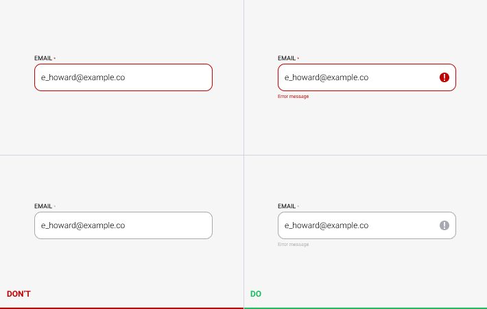
All information, buttons, interactive elements, forms should have distinctive borders, clear labels, and be easy to identify. The information and call to actions can be doubled in the body of such an element or around the borders. Regardless of the location, the supplemental description should stay bound to the active element it relates to.
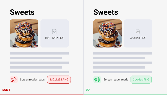
It is important to use an alternative text for pictures for vocalizers to allow reading of what is shown on the media. The quality of this text is important as well. A senseless combination of words, numbers or letters would not serve well.
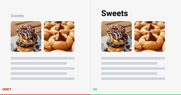
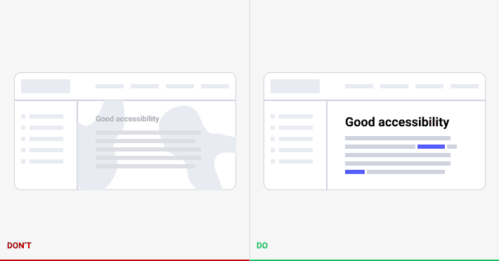
The headings should be distinctive from the general text body. They can call special attention, though should describe in short the topic of the next box with the information. If the text is given in several columns, it should be understandable from the position of the heading to what column they relate.
The text letters should have sufficient color, size, and contrast. The contrast should be tested under different external conditions and on various devices. The sufficient index for a monitor screen in the dark can appear non-visible for a phone on a sunny day. The text letters’ size can be dynamical and change depending on the user’s device. Additionally, it should be intended for voice over.
If to take particular disorders, it is possible to outline deuteranopia and protanopia – the inability to distinguish red and green. It is impossible to convey to a person some additional information through these colors. On the necessity, it is possible to offer an alternative color scheme or descriptive text for a better understanding of auxiliary effects.
Dyslexia also brings some confusion to the creation of inclusive design. From 5 to 20% of children face this disorder, and not each of them gets rid of it in the future. As a result, a person can not read correctly, shuffles letters in the words, can not grasp the information. The application of special typescripts can help to overcome this disorder.
Audio disorders
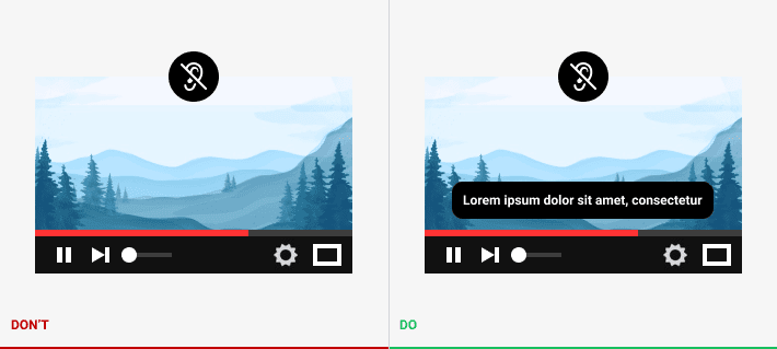
One of the easiest ways to assist a person with audio disorders to get information is to duplicate it through visual and/or kinesthetic channels. The most common case – the introduction of transcripts and captions for multimedia.
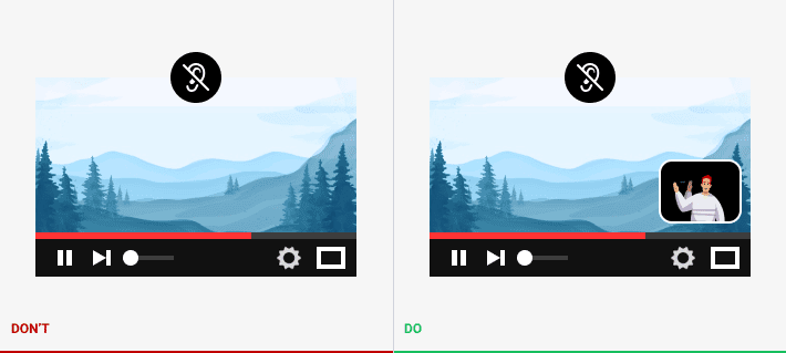
There is a bunch of various approaches to finger language use. In some cases, if the product should deliver the massive amount of information through the audio channel, the type of finger language, understandable for the target audience, can be applied. Such kind of video can duplicate or entirely replace the multimedia element.
Physical disorders
Various disorders that appear due to physical instability require the attention of designers, as well.
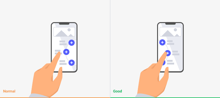
The following situation can not be named as a disorder but a peculiarity of a group of users who prefer to use the left hand instead of the right. Most of the buttons in smartphone applications are located in the bottom right part of the screen. Left-hand orientation should arrange them in the bottom left.
For those users who find it difficult to navigate through the application with a mouse, it is possible to introduce the performing of various commands with hotkeys. A simple combination of 2 or 3 keys can help saving time if to compare with the time needed to perform the same actions by using the mouse only.

Speaking about the keyboard, it is needed to mention the focal underlining of the active section. In this case, the button leading further in navigation should be located in the header. It gives the possibility to skip several steps and continue working with the content. The user should precisely understand where on the screen they are located. This is achieved by the means of underlining, making contrast borders or background of the active button current location.

All elements of a hamburger menu, pop-ups, cards, and other similar elements should have distinctive borders and do not cover each other with any elements. The same goes for the text blocks that have active elements.

The possible assistance for persons with tremor is the application of big buttons.
Also, some actions or elements that are basic for the application/website can have their personal button. That will shorten the journey of the user and lead directly to the needed section without numerous steps in the menu.

Voice controls are the option that excludes any physical interaction with the device. Such technology allows users to pronounce the specific commands for the computer to perform. Some fresher technologies expect the application of artificial intellectual features. Such systems learn how to understand not only direct commands but also support communication functions. They can help in some complicated cases when a person is highly limited in capacity. Voice control function can shorten the interaction of the user and the program, as well.
Elderly people
The other group of people who require special attention while operating application or searching around the web is elderly persons. Their peculiarities include a combination of visual, physical and audio disorders. In some cases, elderly people find it difficult to deal with modern technologies.
First of all, it is necessary to assist such a category of users. They can simply be afraid of using technology. This situation can lead to stressful experiences and harm their health. Apply the simple step by step instructions with visual guides and info tips.

While creating interfaces for elderly people, it is better to avoid bright neon colors, complicated architecture, non-distinctive active elements, and forms. Call to actions should have descriptions explaining what will happen if to push the button and where it can lead. Make caution about personal security on the web as such users often suffer from malicious actions.
In some cases, it is better to introduce the common symbols and techniques from real life. For example, make magnifying glass or glasses function to approximate the form or text for better viewing. Elderly people who can use a similar instrument while reading texts in the magazine will quickly understand what this function does.

Inexperienced users
Inexperienced users due to some external or internal factors do not know how to deal with modern technologies. They require assistance in navigation through technology.
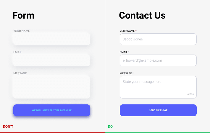
All fill-in forms should help users with text, provide suggestions or examples inside the form. It is possible to add the description inside the form or near it. Such descriptions that are located outside the form borders should clearly relate to a specific form. It is better when fill-in forms can accept several variants of the requested information. Typically, that situation deals with the introduction of phone numbers or addresses. The user should not guess what format is acceptable and which is not. Especially if the user does not aware of all possibilities.

This category of users values the possibility to ask for help and to be heard. In such a way, a section with the feedback and contact forms should be easy to find.
All navigation should be as clear as possible.
Text links should be meaningful. Links can be introduced by variable means, so it can be difficult to distinguish them in the text body. Any link should bring the description where it leads and for what purpose. The person who is difficult to operate the technology should clearly understand what will happen after their actions.

General recommendations
The next section underlines the general recommendations on how to create a comfortable interface and become a step closer to inclusive design.
All pictures should have meaningful alternative text. It will help not only for screen reading programs that can read the description for people with visual disorders but also for robots that scan the web page to define its contents. In turn, that will help to strengthen the positions of the website in search.
Try to avoid captcha and similar technologies on the website. It creates difficulties for users, spends in vain their time, and brings negative experience. Prefer using other validation means to confirm if the user is real or not.
All page titles and heading should be meaningful. Titles will help users to arrange the information in blocks and separate what is useful for them. The heading in the text helps to convey meaning and shows the structure. The user can promptly analyze the headings, presume what particular information is in the boxes, and choose the needed section.
The architecture should strive to make the user’s journey as short as possible. The core information/functions or at least links to them should be placed at the main screens. The information should be structured in blocks or sections and have meaningful links.